Logo Design, Branding Identity, Marketing Materials
About the Client
Native Planet is a St. Louis landscaping business focused on designing custom gardens with plants native to Missouri. Founder Nick Ciaramitaro collaborates with clients to evaluate their outdoor spaces and create thoughtful garden plans using regionally appropriate plants. He then locally sources the plants and manages the installation and ongoing care of each garden.
The Challenge
When Nick approached me for brand identity services, he was interested in incorporating space-inspired elements alongside nature imagery while maintaining a brand that felt both playful and professional. Through research and concept development, we intentionally moved away from the common leaf motifs used in landscaping logos to create a more distinctive and memorable visual identity.
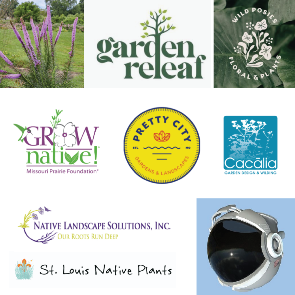
CLIENT INSPIRATION
My Design Process
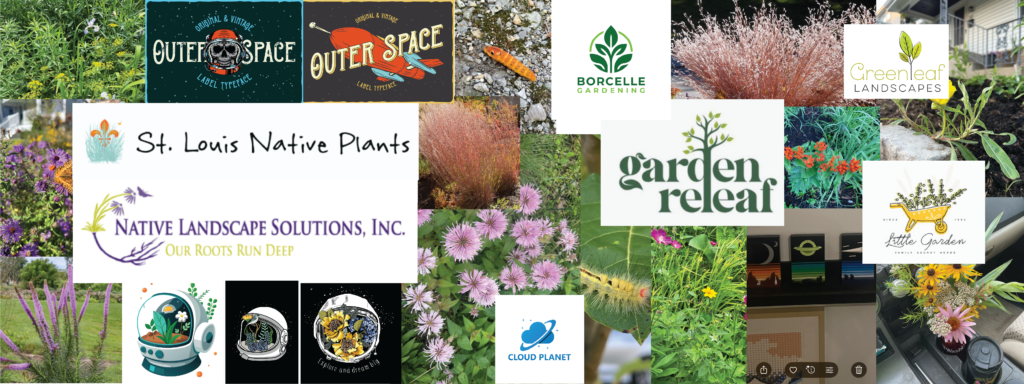
Step 1: Research and Create a Mood Board
Step 2: Create concepts and share with the client
Nick’s initial idea was to create an upside down astronaut helmet with flowers growing out of it for the logo. We also discussed including pollinators, an orbit, and planet imagery.
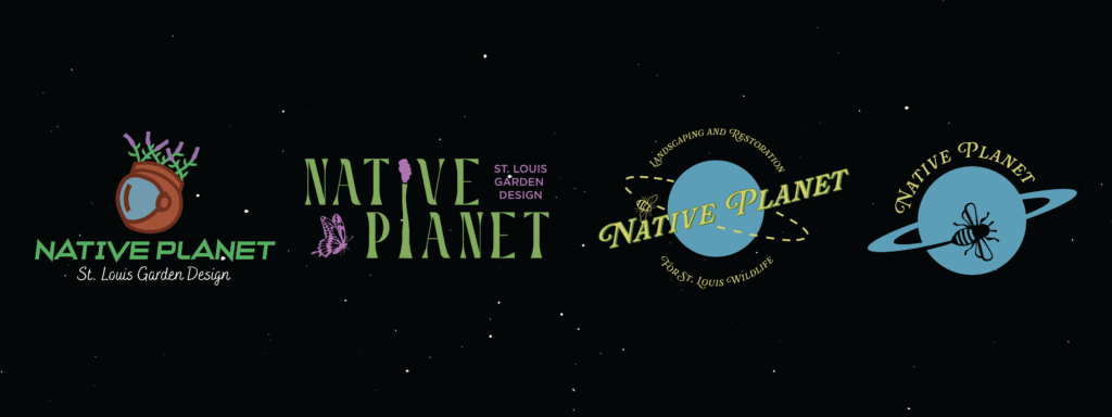
STEP 3: INCORPORATE CLIENT FEEDBACK AND ITERATE DESIGN
Nick decided he wanted to move away from the astronaut helmet idea and explore the pollinators circling the planet shape more. He liked the font of the third concept, but wanted a simplified version of a flying bird or insect that would work well as a 1 color logo. He wanted to see firefly, hawk, and dragonfly options. He also wanted to explore “Native Planet STL” vs. “St. Louis Native Planet” wording and horizontal and vertical logo options.
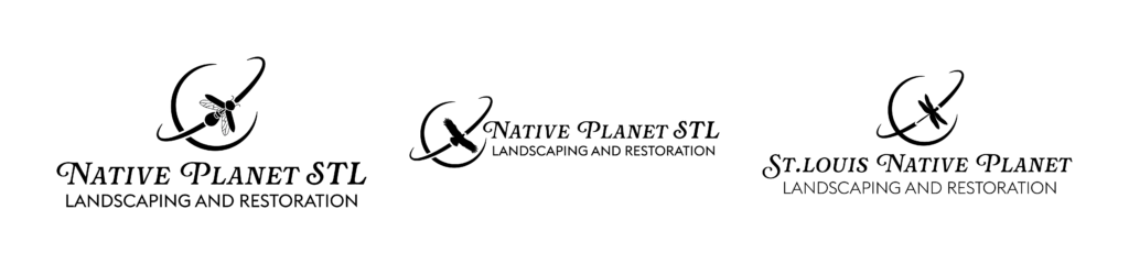
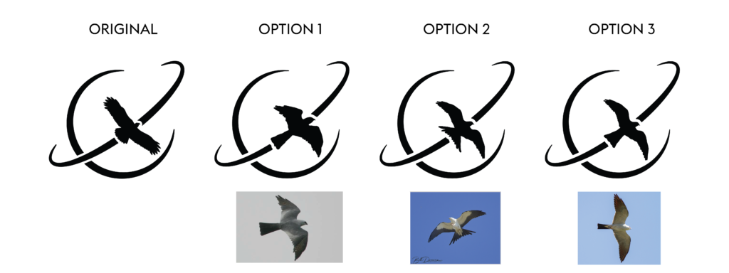
Nick decided he wanted to go with a bird circling the planet for the design, but wanted it to specifically be a Mississippi Kite. He shared a few photos of different angles the bird could be flying in and I presented the hand drawn options below.
Step 4: Finalize logo design
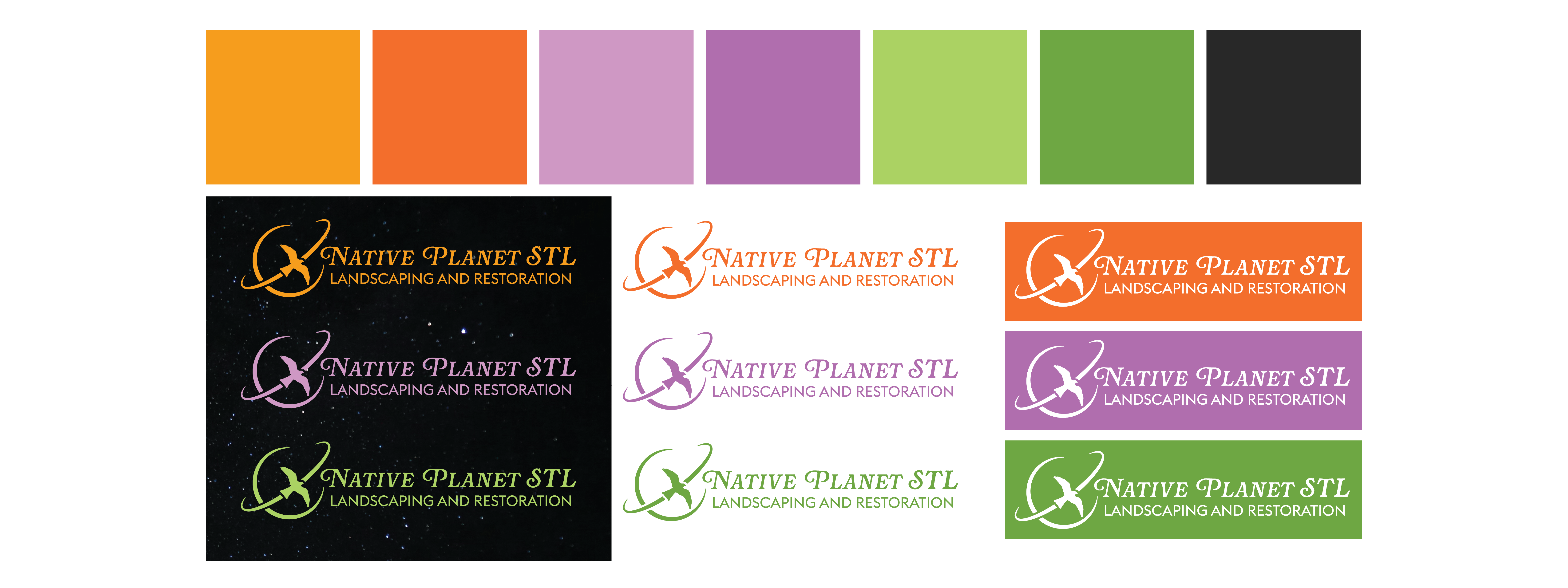
The final decisions were “Native Planet STL” text, the Mississippi Kite in flight using option 3, and a vertical layout as the primary logo.
Step 5: Select Color Palette
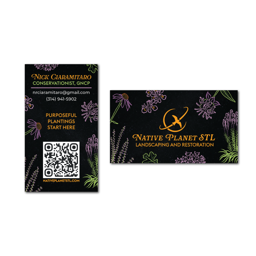
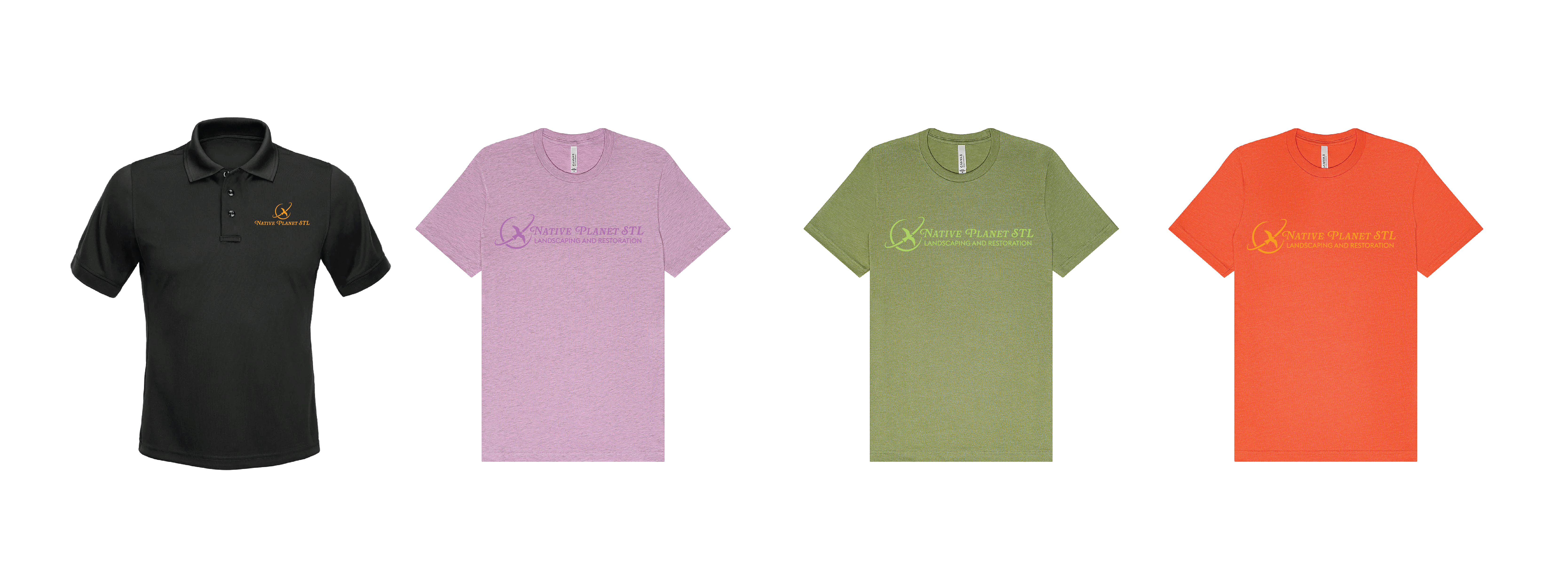
The color palette draws inspiration from Nick’s photography of native plants while also referencing the brand’s space concept. Vibrant oranges, purples, and greens reflect the natural colors found in local flora, while charcoal provides a strong, grounding neutral. We considered both orange and green as the primary brand color; ultimately, orange was selected for its distinctiveness among local competitors and its strong contrast against the dark background.
Step 6: Create patterns and illustrations
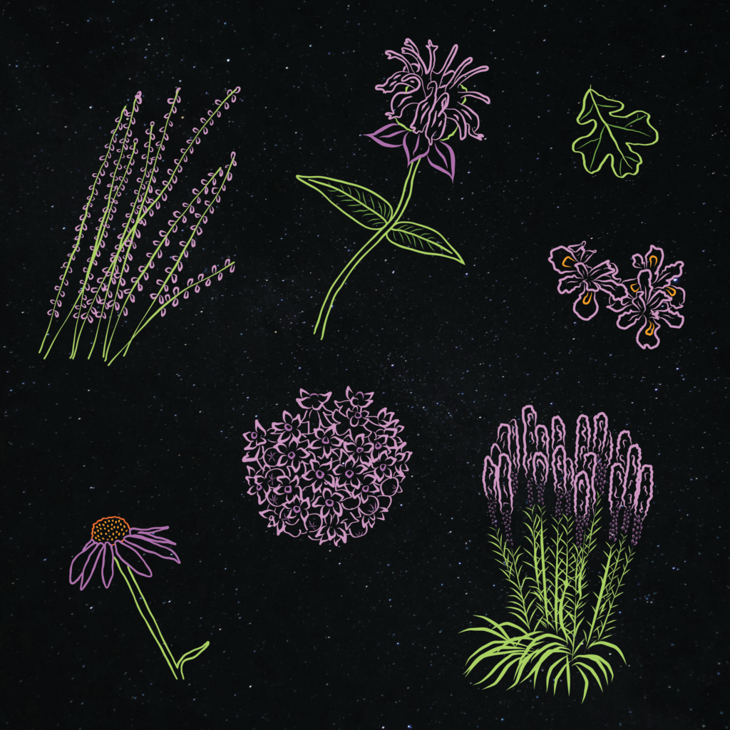
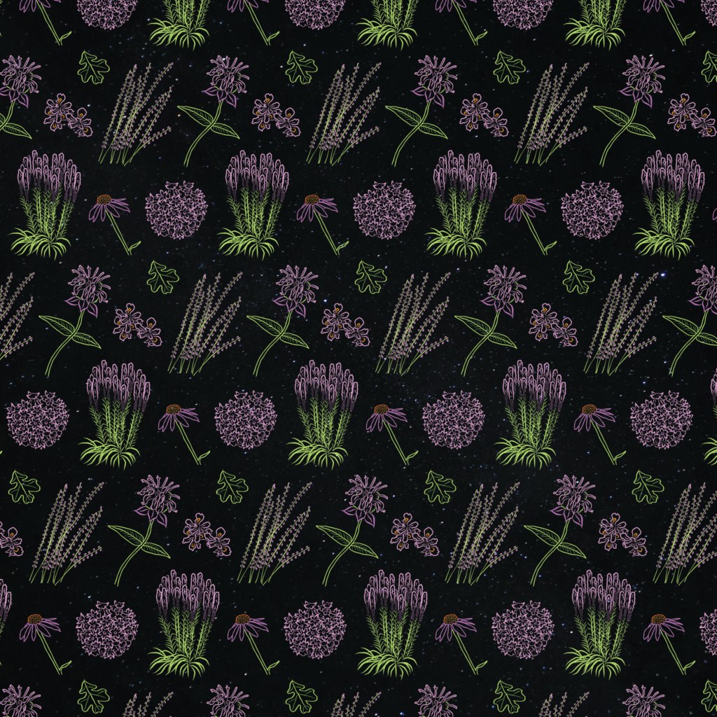
These hand-drawn illustrations of Missouri native plants extend the brand identity beyond the logo by introducing a flexible visual system. They function as website icons and decorative elements across marketing materials, reinforcing the brand’s connection to local ecology while adding warmth and personality.
About My Solution
After researching local landscaping brands and gathering visual inspiration, I began exploring ways to incorporate Nick’s interest in space imagery while still reflecting the ecological focus of his business. The final logo features a Mississippi Kite in orbit around a planet, referencing both the “Native Planet” name and the connection between wildlife and native plant ecosystems.
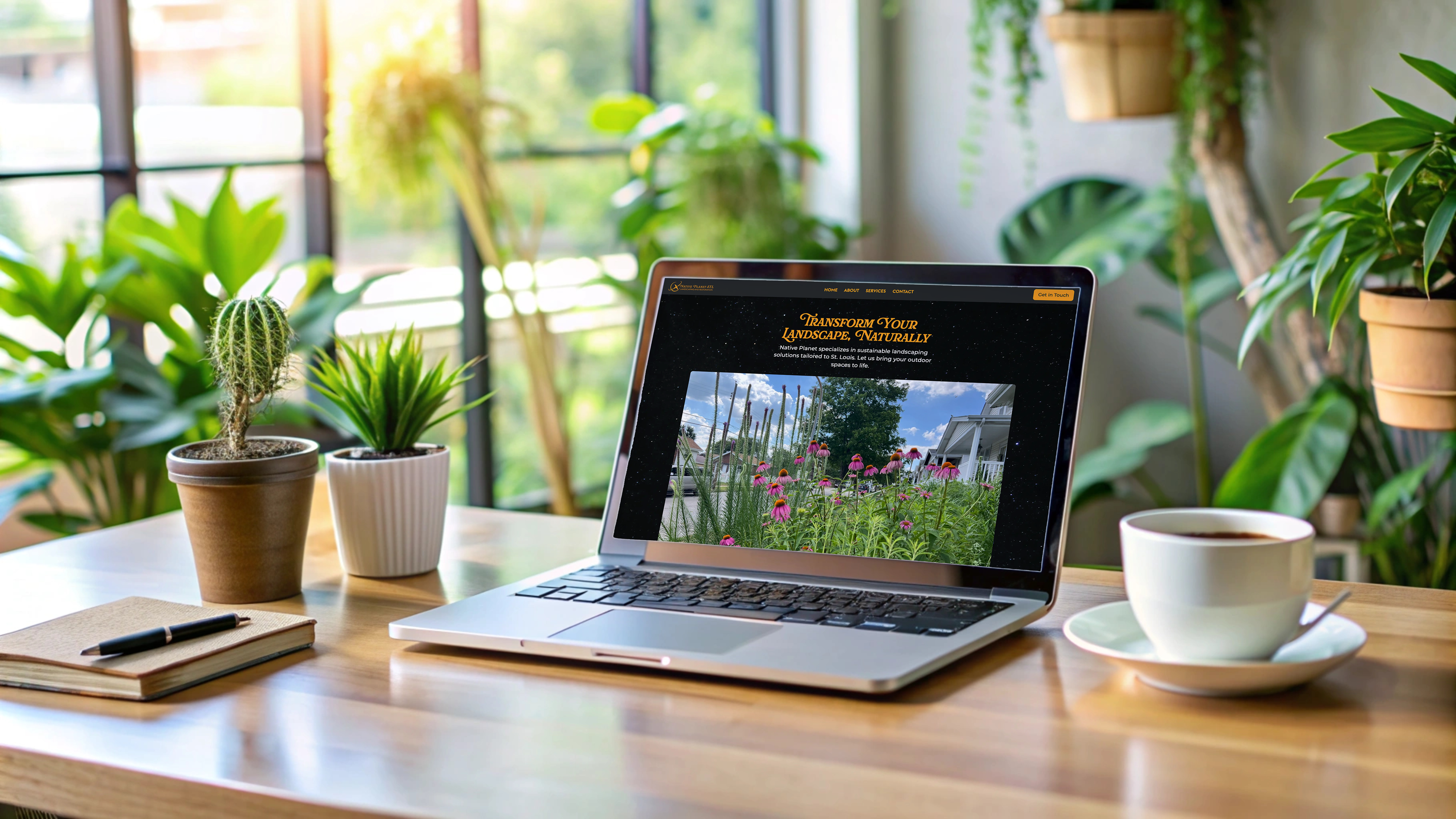
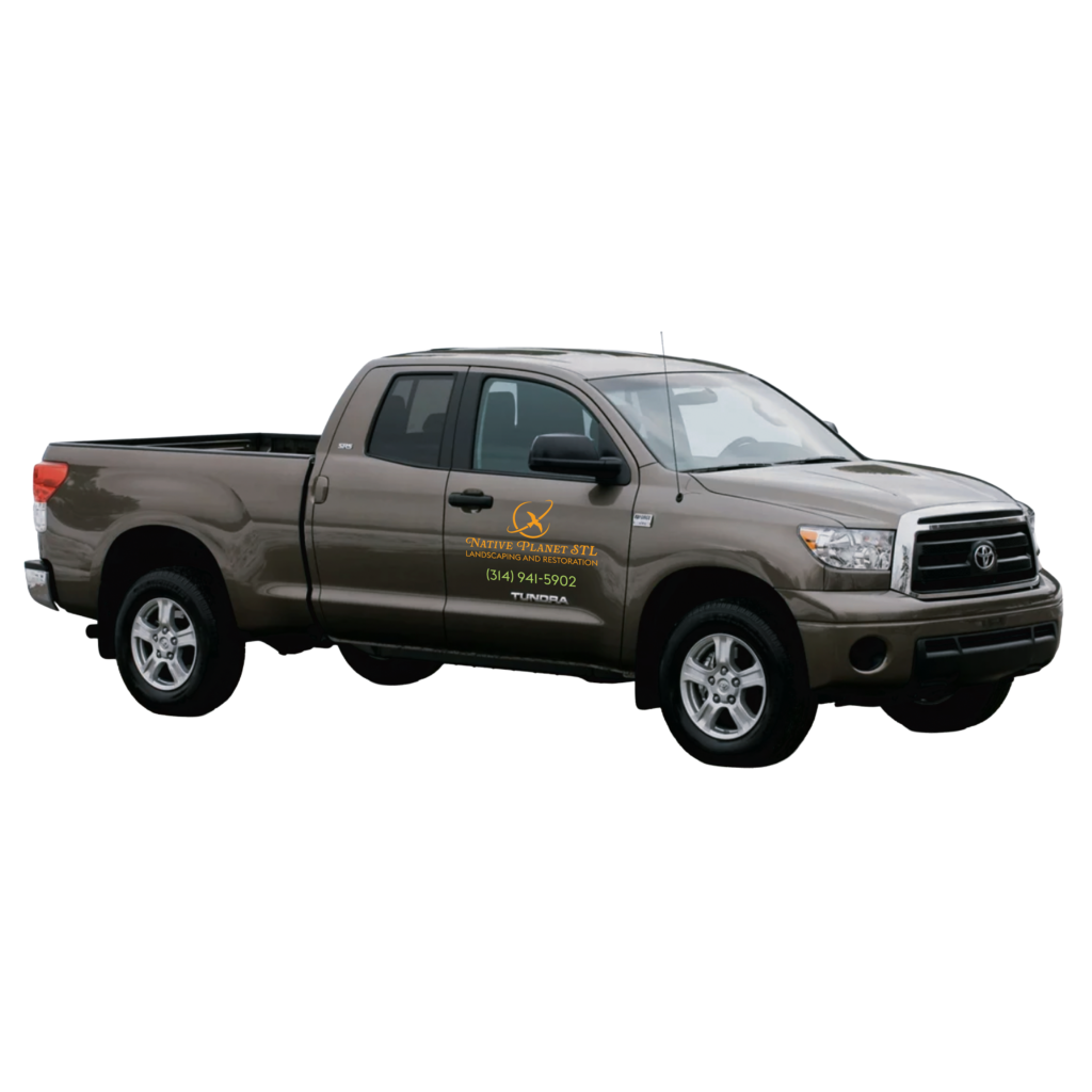
The mark was designed to work across a wide range of applications, including invoices, business cards, truck decals, and the website. Its simple one-color structure ensures legibility and flexibility at different sizes, while a set of logo variations allows the brand to adapt stylistically depending on space and context.
To reinforce the space theme, I developed a dark color palette inspired by outer space. I balanced this with brighter accent colors drawn from Nick’s photography of native plants, adding a sense of whimsy and playfulness to the brand.
I also created a series of hand-drawn illustrations of seven Missouri native plants to support the visual system across marketing and digital materials. These include purple coneflower, side-oats grama, common milkweed, marsh blazing star, crested iris, Bradbury’s bee balm, and a post oak leaf.
The typography system pairs a more expressive primary typeface with clean sans-serif secondary fonts for body text and informational content, ensuring readability while maintaining the brand’s playful character.